2/26/11

Western Playland

Today I decided to use the last of my Artistic TZ at our local amusement park, Western Playland. It wasn't a very sunny day, though. It was partly cloudy. Bee won a little Smurf toy for me playing a game where a girl was supposed to try and guess her name for $5. She didn't guess it, so I got my Smurf. I took his picture with my Pentax K-1000. I should be getting the roll developed sometime in the next few days. So, there will be more amusement park fun photos in 35mm-I'm very excited because it's the new Kodak Portra 400.

El Bandido

Tilt-A-Whirl

Yo-Yo

Carousel

Frog Hopper

2/20/11

I love you, PX70 Colorshade Push!

I've finally gathered enough shots to do a post on the Impossible Project's newest color film, PX70 Colorshade Push!  It's no secret that I'm in love-I've been Tweeting madly about it since my first shot.  I want more.  The only caveat is having to peel and/or transfer the emulsion to paper to avoid colorshifting.  I ruined a few nice shots peeling it.  Some of the emulsion lifted and cracked in the process even though I was very careful.  At least I have the scans, but I'm not sure if it's such a good idea to be peeling the fragile emulsion anymore.  I might let them just shift into blues.  I have not yet attempted an emulsion lift, but I will, because I hate the way the shots look peeled.  They need a ground-and they just look too messy peeled, in my humble opinion.  I'm going to do some close-ups with this film next-I'm noticing I haven't tried any yet...maybe some liquid-in-a-glass shots and food shots!  Yeah!

First decent shot-but I forgot to hold down my homemade shade-also I made it out of cardboard that was too thick-so it obstructed the slot the film ejects through.  Hence the distortion on the bottom...it was a super-bright sunny day-a little on the cold side, so I put the upside down film next to the heater once I got back into the car with Bee.  She's a cute model-ha-my girl. :)

This would have been good but that thick cardboard shade again...also not sure why I had the camera so crooked.  I must have been distracted by the film not wanting to come out due to my dumb too-thick cardboard shade.  I thought my newly acquired SX-70 was not working properly-I was pretty sad that day-until I figured things out.

This is the only shot that I liked where good things happened from my thick cardboard shade mishap.

I love this shot-it's the first of my "most favorites" PX70Push! shots.  Bee looks very grown-up though-it kind-of freaks me out, but also makes me proud of her.

A very good background I found in the ghetto-this was painted on the side of a daycare.  Bee was agreeable that day, too.  It's because I bribed her with a new jean jacket, which can also be seen below.

I made these bubbles happen by overheating the emulsion with my blow drier.  I was trying  an experiment.  The colors did get more saturated, but I went too far, the heat was too much and the bubbles did not go away.

In this shot I was trying to gauge how much difference I could get by turning the exposure dial more towards lighten.  I turned it all the way to lighten here.  No bad I guess, but probably would have liked it more if I had left it in the middle.  This house is actually aqua.  I've shot it before-you might recognize it if you've seen my other photos in the last few months.  I HAD to go back and shoot it with this film. 

More overexposure on purpose-but if I had known it was too much by looking at what was happening to the previous shot, I would have moved the dial back to the center.  It was super-bright in this wall, direct sunlight.

Another crooked shot-not sure why, I thought I had the camera level-it would have been good if it was level!  Damn.  Lavender is nice, though.  Worth sharing just for the color.

This has got to be my most favorite shot so far with this film in terms of color.  The sun was starting to set, it's up at the top left beyond the frame.  I thought the storefront would be too dark because of the strong sun-and with me shooting towards it...but was very happy to see I was wrong.  This feels true-to-life although these colors are like cotton candy.

I wasn't sure if I should share this right now, because I think if I scan it tomorrow the colors and contrast will improve some, but what the hell-it's charming even as-is.  This is Bee and a random little boy sledding down the hills at the park this afternoon on cardboard sleds (there's no snow-this is the desert, we don't need snow to go sledding haha!)-made me wish for a little boy of my own.  He was just the cutest, sledding next to Bee on a pizza box.

My first PX70 Colorshade self-portrait.

2/12/11

Tiny Blue Flowers

So, I thought that since I haven’t yet attempted to create an “insanity” drawing, that’s exactly what I would do.  I made the decision to proceed with it when I was about 3 hours into my first drawing for this term’s first drawing portfolio for school.  It has proven to be an incredible mental challenge, but one that I always knew I was capable of doing.  I made a commitment to completing this drawing in just about 3 weeks, so I have had to do something I haven’t done yet up to this point, which is allotting a specific amount of time each day towards working on it. 

My thoughts during the work vary from meditative and calm, to anxious and completely random.  Since I am creating tiny blue flowers with 7 petals, I count 1-2-3-4-5-6-7 repeatedly.  If I go off track in my thoughts, that is when the flowers have 5 or 6 petals instead of 7.  I am creating half-flowers to indicate movement here and there.  The drawing started off being a take on a fabric pattern, but not a graphic interpretation of it.  I wanted to draw fabric as if being worn by somebody, so I thought of moving fabric…as if the wearer was taking a walk on a breezy day.

I am at about 60% with it now.  I have decided to cover almost ALL of the white space of the paper with these tiny blue flowers, in varied shades and values.  When I first began, I did not consider certain details that I am now going by in my progress, such as NOT erasing.  I plan to create density and variation to indicate movement by layering these tiny flowers, even if the detail of some of them ends up being blurred away.  I am using Prismacolor Pencils.  The paper is 22x30” Stonehenge.

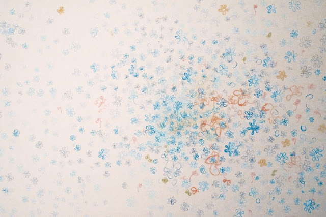
The colors are a little off here-I promise to take a proper color-correct photo when it's finished.  This is only about a 6-7" area-the entire drawing is 22x30".

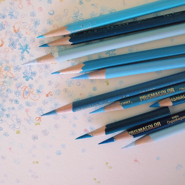
These are all the shades of blue I'm using-I think the only one missing here that I am using is Indigo Blue.

I will be doing another similar drawing in shades of gray on Japanese paper for the second term of this semester.  I keep thinking about how I want to try everything I have been doing in grays.  I tend to stick to these girly candy-colors, but I feel I need to clear my mind, I need balance.  It's like inhaling coffee beans in-between smelling different perfumes, I think.